HOW IS THE DESIGN OF THE PERFECT CONTACT FORM?
Brief, accessible, simple and in the Earth language.: HOW IS THE DESIGN OF THE PERFECT CONTACT FORM?

That a contact form, of any type of web page, is accessible is the fundamental thing. It is the way in which users will contact you on the website , and it does not hurt to make available to users all the means of contact you can: links to social networks , telephone, address, in short, what is at your hand and in line with your business.
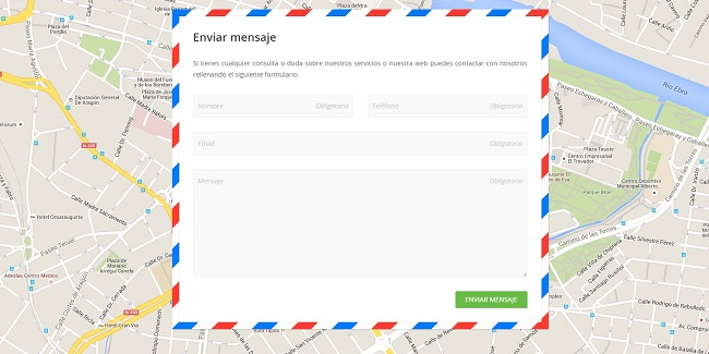
The contact form, in addition to being accessible, that is, it must be found quickly on the web page , it must have a careful design and be easy to use. Of course, web design is something to take care of throughout the web page .
But what should the web design of a contact form look like specifically?
You must respect the corporate image of the company and the rest of the web.
The submit button must be clearly visible
Notice to fans of the predefined CMS! The form must be in Spanish, or in the majority language of your users, none of those CMS forms such as WordPress, Drupal, Magento, Joomla … that come out in English and then you do not know how to change it, or you only change some of the phrases , in a curious Spanglish that takes quite a bit of seriousness from your business.
Brief: Request the data you really need to contact the user.
| It is a contact form, not an interrogation. |

Remember this also for the registration forms on the website . In case you really need a long contact form, have the mischief to put it in different steps, not all on the same page, and you will not scare users so much.
Easy: Clearly indicate which are the required fields, do not make 200 notices jump in red after you have given it and send, and now, if you indicate it clearly and still do not fill in half, it is their problem, but you, make the process easier for him. If any field to be filled in can cause confusion, indicate in some way how it should be filled in.
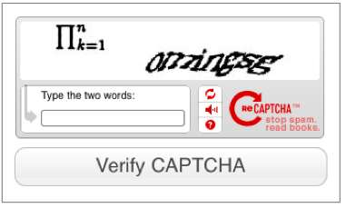
If it is convenient to add captcha systems, which also does not have to solve the Ramses II hieroglyph, it must be done in the simplest way in which spam can be avoided, but without leaving blind people or with the feeling of losing cognitive functions to users.


